Being in IT Support, we observed that many issues were similar to one another over a period of time. Also, there were known errors in the system that could not be fixed for various reasons, and support engineers typically consulted the Known Error Database (KEDB) as the first step of investigating the issue.
Coincidentally, the KEDB was a short description of the issue, and a set of SQL queries that were run with parameters specific to a user of the app, that the operations support team used to manually modify and run one-by-one.
With the knowledge we had in web design and Java Servlets, we were able to aggregate all the queries specific to an application into a web app, that anybody from the end user to the support engineer to quickly debug the issue.
The logic here was that if the issue was a known error, we could match keywords of the description to the KEDB, and if the user had access to the application, they would never need to follow the complicated process of contacting several support teams.

Type Initiative, Pair project Role Ethnography, UI Design, JSP Servlet, Evaluations Duration 3 weeks (Dec 2014-Jan 2015) Tools Task analysis, HTML, CSS, JavaScript, Java JSP, SQL Server, Web analytics Objectives Process Automation, Turnaround time optimization (CWTT and SWTT), Grass roots troubleshooting
Having worked in the L2 team, and having coordinated with other L2 teams, I had a pretty good idea of the extent of the problem - a mind-boggling 90% of the support tickets are solved with the information in KEDB and the time to solve the issue is much lower than the time it takes for a support engineer to get the ticket from the user, log it with the L1 team, and begin to work on it amidst their other work.
The Solved Within Target Time (SWTT) and Closed Within Target Time (CWTT) were KPIs the client deeply cared about. This was a particularly opportunistic case because most issues can be addressed by the user, and it takes more overhead and wait time for even contacting the support team.
The idea was borne out of the drive for automation that started in the workplace. We were appointed as Automation Engineers in secondary role, and we were asked to come up with ways to improve the process of handling tickets. This was one of our first ideas - letting end users have a shot at solving the issue themselves instead of waiting for the support team to respond, wasting several business-critical hours. The support team would also have access to the investigator for quick diagnosis.
We did some research into the information architecture of these applications, and a few interviews with the support team about what fields they consider most important during troubleshooting. (We were simply given the SQL files they used - we studied it and inferred the important ones ourselves). There were also other limitations we had to work with: Some applications had multiple geographic regions with varied fields, therefore templates would have to be customized based on both application and region.
Although support engineers sometimes had to manipulate the database, for reasons of security and because the application was targeted to end users, the interface was purely query-only. No database write operations would be permitted on the application, although database writes would have saved support engineers even more time and effort on this tool.
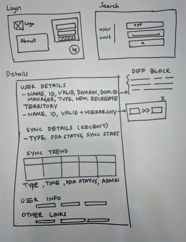
Because of the variation in the information architecture of apps, as a starting point, I picked the application I was most familiar with, and made a basic wireframe simply listing the attributes that were important. (These were my pre-HCI days, it was more of an engineering blueprint of sorts)
We then jumped straight into high-fidelity prototypes, because this tool was more function than form.
The UI was delivered as raw HTML, and was then intermixed with the appropriate JSP to display the results at the appropriate places.
A valuable lesson learned here was the separation of concerns. By using jQuery and JSP and having JSP pages, the user interface was tied to the frontend, allowing for much less flexibility for UI changes.
We applied this principle when we created the Paperless One tool.
From the ongoing feedback from users, we added some features after the project was completed.
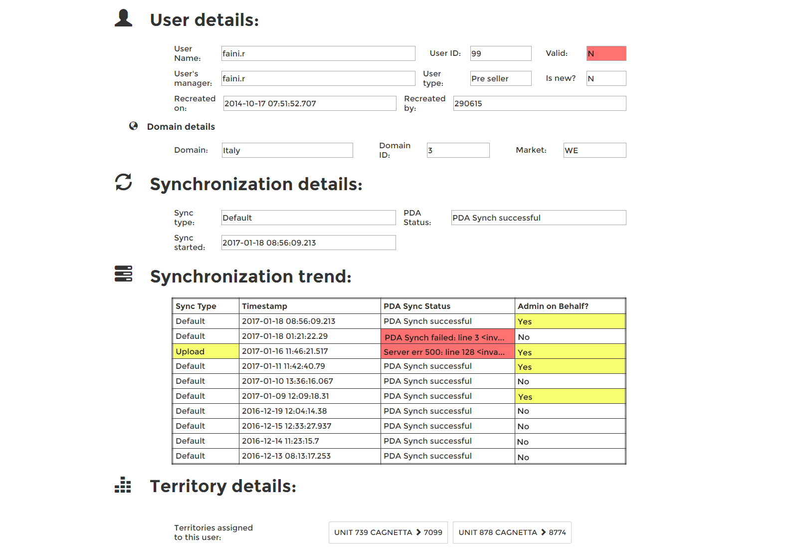
Color-coding possible error points: The most common errors were highlighted in red while the values that might need attention were highlighted in a less attention-seeking yellow. This reduced the cognitive load of going through the text to locate the error, by differentiating with colors, which was more efficient.
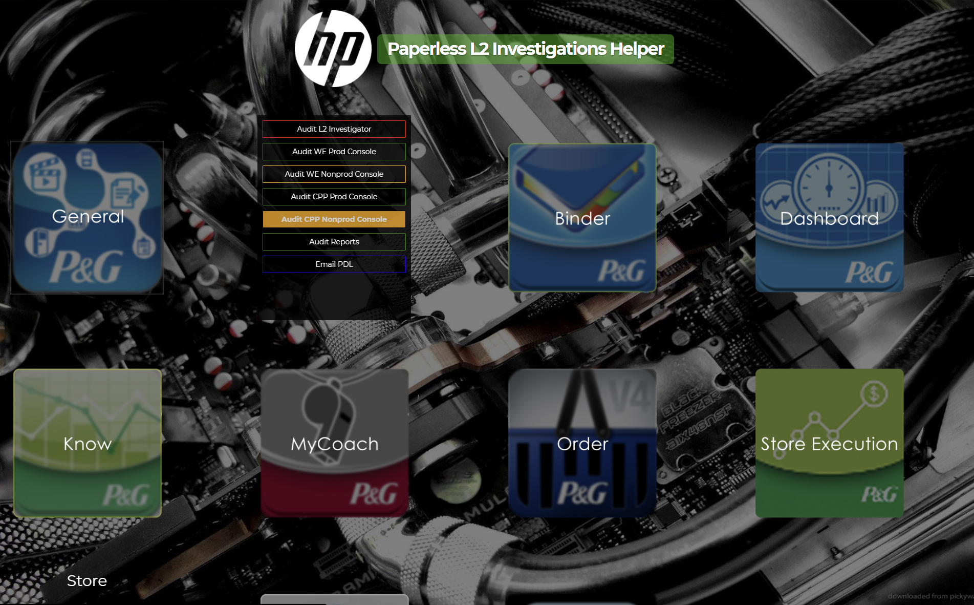
Centralized link repository: Because it was difficult for support engineers to keep track of where these applications were hosted, we made a landing page of sorts that listed the relevant links to the application.
Keyword matching: Describing the error would trigger a keyword search in the Known Error Database, linking users to similar issues with steps on how to resolve them.
Even though this tool was not released to end users (as of when I quit working) due to various reasons, the productivity of the L2 support team went up drastically when the load was heavy. This usually happened at FYEs and before holidays when a lot of users were finishing up work and inadvertently made mistakes entering data that could cause problems.
The average turnaround time for support tickets went down from 2 hours to under a minute, because this tool executed multiple queries, correlated them and showed possible error points automatically.
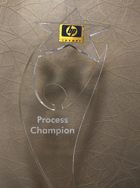
The process improvements brought about by this workflow automation also won us the Process Champion Award at the Center level.
