Loading, hang on...

WeSeeHope is a UK based non-profit organization that aims to enable children isolated by poverty and create sustainable opportunities for people in Southern and Eastern Africa.
With the data they have collected across period of 3 years that includes 17 partners supporting over 200 groups and their activities, WeSeeHope wanted to provide reports to their partners about the effectiveness of each of the programs and where funds had been utilized.
The main problem was that there was no engaging way to show insights from their data. Moreover, some of this data was missing, duplicated, or otherwise invalid. If they could By representing this data in a visually manner, they could convey their impact better to potential partners instead of providing a textual report.
After looking at the data, we decided most of the data was missing or non-standard, a risk of collecting data from multiple, free-form sources. Therefore, the first stage was to combine the data from several spreadsheets into one dataset, and then rank the attributes according to the order of importance for visualization.
With data cleanup done, we had to understand the story our clients wanted to convey, and what kind of insights their users wanted out of the data. This involved discussions over many calls to understand the data and its importance.
After a series of prototypes, we settled on a set of designs (because a single visualization could not convey all the data they wanted to show), and handed it over, with a brief video to show the class a demonstration of what we had done.
Type Class, Group Project Role UI Design, Data Analysis and Cleanup, JavaScript development, Video Creation Duration 5 months (Aug 2016 - Dec 2016) Tools D3.js, HTML/CSS, jQuery, SVG.js, HighCharts, Tableau, Adobe Photoshop, Camtasia Recorder Objectives Dealing with real-world data, Information Visualization, Storytelling, Working with clients
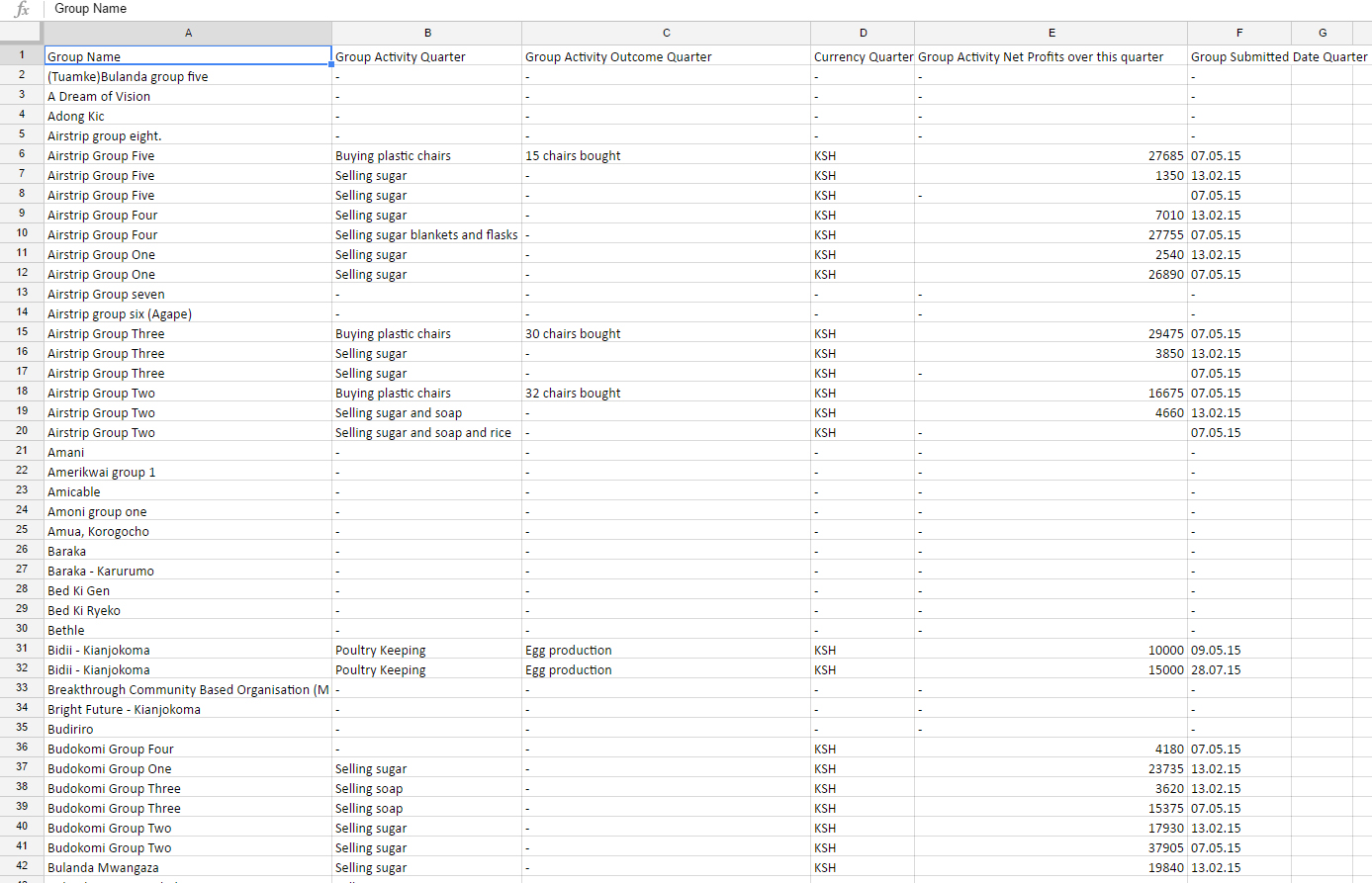
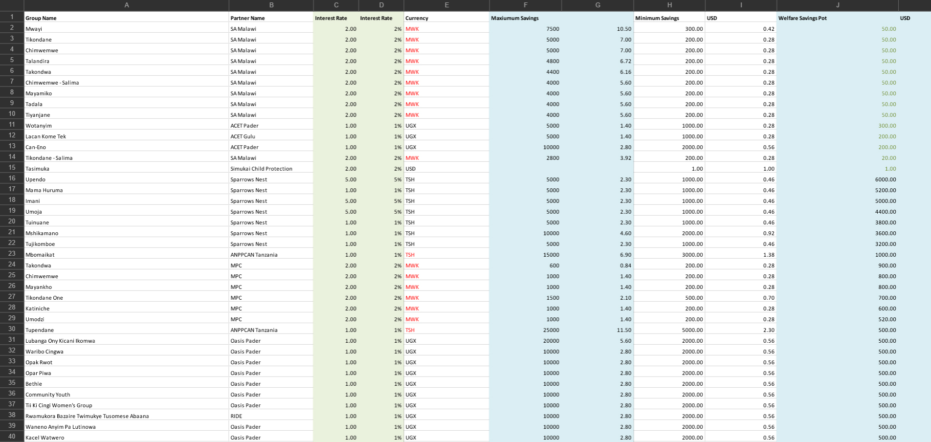
We were given was a set of four spreadsheets with about 3 years of data, much of its data missing (possibly unreported). Despite several attempts, there did not seem to be an easy way to get the data. Moreover, some reported activities were reported differently (Example: "poultry", "chicken farming", "chicken rearing", "poultry keeping" were all in the activities field and they all meant the same)
There were also other issues with data such as non-normalized finances reported in local currencies, and fields that could be simplified for visualization (for example, "interest paid" was more appropriate than "principal borrowed" and "interest rate" and "loan period").
After several calls with WeSeeHope, we understood the meaning of certain fields, how data was organized, what data was important to them, and other facts about the data.
Then, we collaboratively identified the fields that were important, and the ones that were no longer necessary. The latter were removed for the sake of clarity as well as to speed up the rendering of the visualization.
Python scripts helped us a lot in data cleanup. Some of the simple scripts I wrote listed and mapped duplicate values, converted currencies and so on.
Finally, for the sake of visualization, we decided to convert our (remaining) processed data into JSON for easy access by d3 and other JavaScript visualization frameworks.
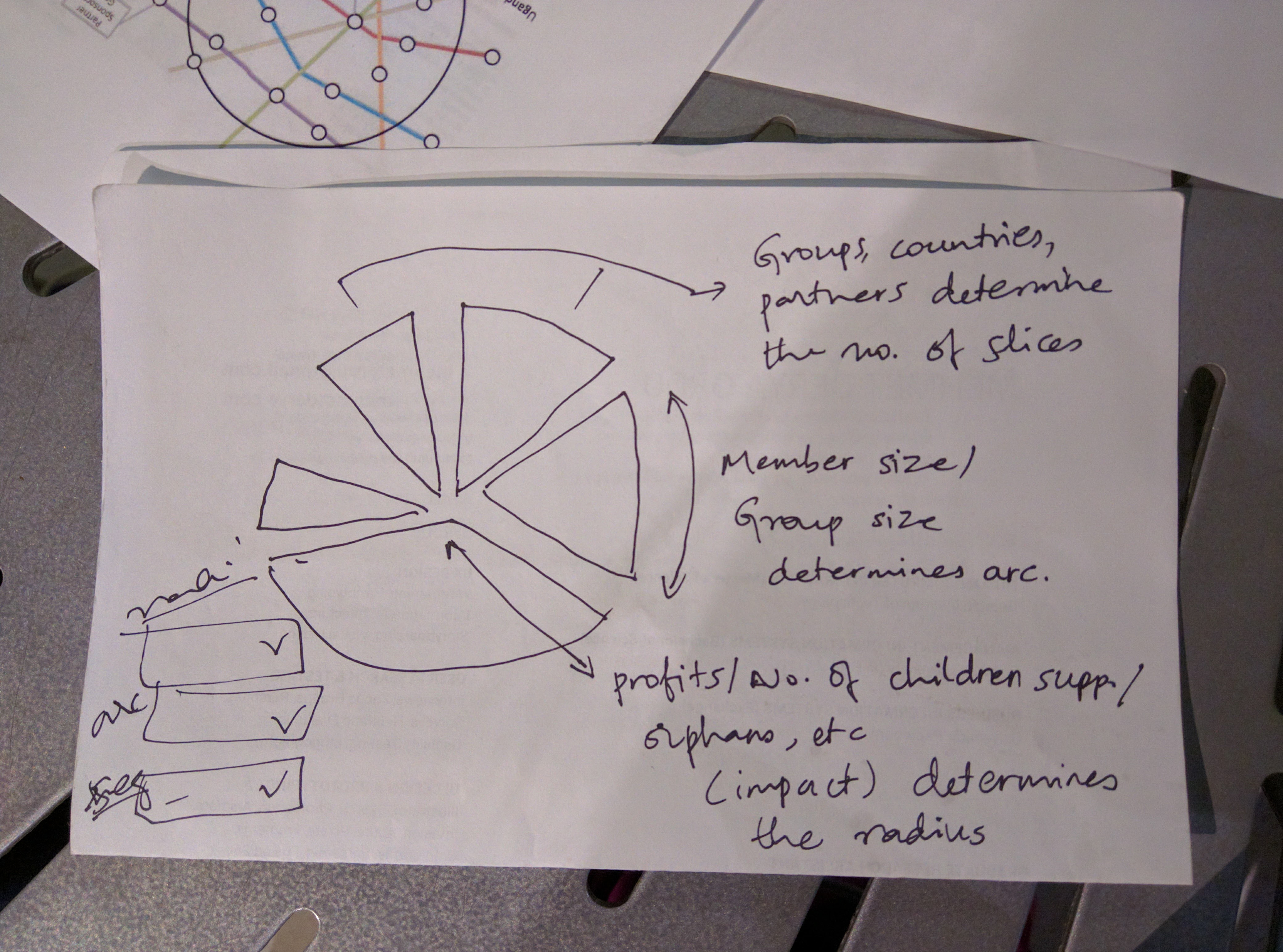
The first ideas are best gotten through pen and paper, allowing for quick prototypes and changes without committing to anything.
After some preliminary ideas, we also used Illustrator, Photoshop, Tableau and other tools to play with the data to get more ideas about what visualizations make most sense.
As for any design, feedback is critical to refine and iterate designs from the early stages. Therefore we made a poster to present both to the class and our clients, ranking the effectiveness, understandability, and visual appeal to our audience.
For the class, since they were not the primary consumers of the data, we had to outline the problem and goals of the visualization. This gave us a unique perspective of visitors to WeSeeHope website, and how much of a narrative would be needed for the visualizations to make sense.
We got good critique from our clients as well, like the logical groupings and prioritizing straightforwardness of interaction than making the interface visually sophisticated. Below are the slides we presented.
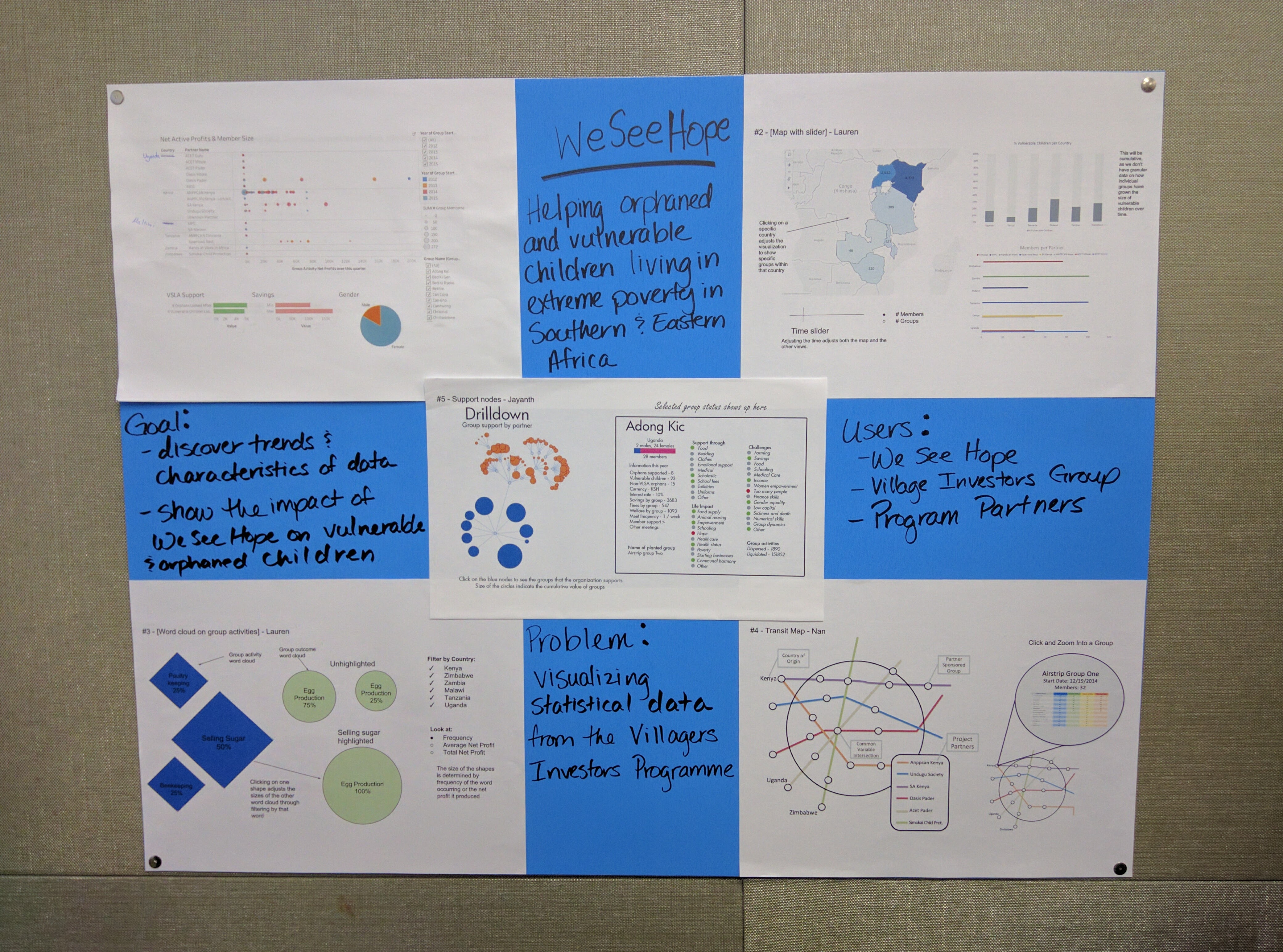
The final visualization consisted of five different visualizations, each of which could be taken independently and reused by WeSeeHope.
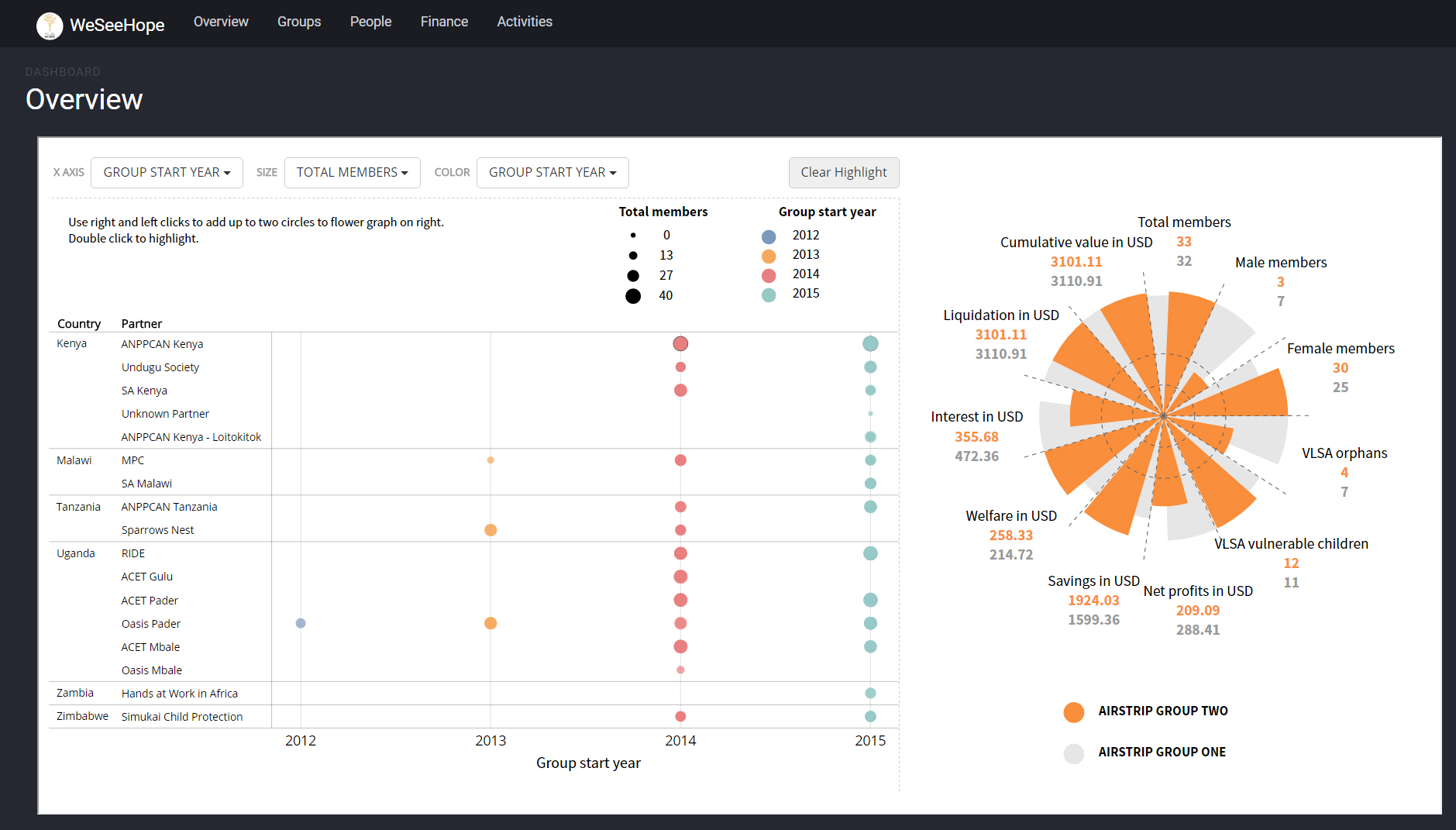
Exploratory Analysis: This visualization is similar to Tableau, where one can chose their X, Y and Size axes to visualize data. This was implemented so WeSeeHope and the leaders of the Village Investors Program could gain insights we missed from the data, now or in the future. To enable easy comparison between two groups, we also added a flower graph on the side that compared all known attributes from two selected groups from the exploratory view.
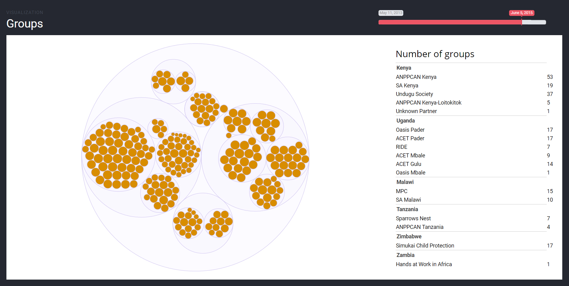
Evolution of groups over time: This view shows, with the help of an interactive slider, which groups evolved in what countries. Though we wished to show the increase in size of the groups at that point of time, we did not have that information - only the current headcount. Also, a Chloropleth map with the countries did not make sense to our clients, because the exact location of the groups were not known.
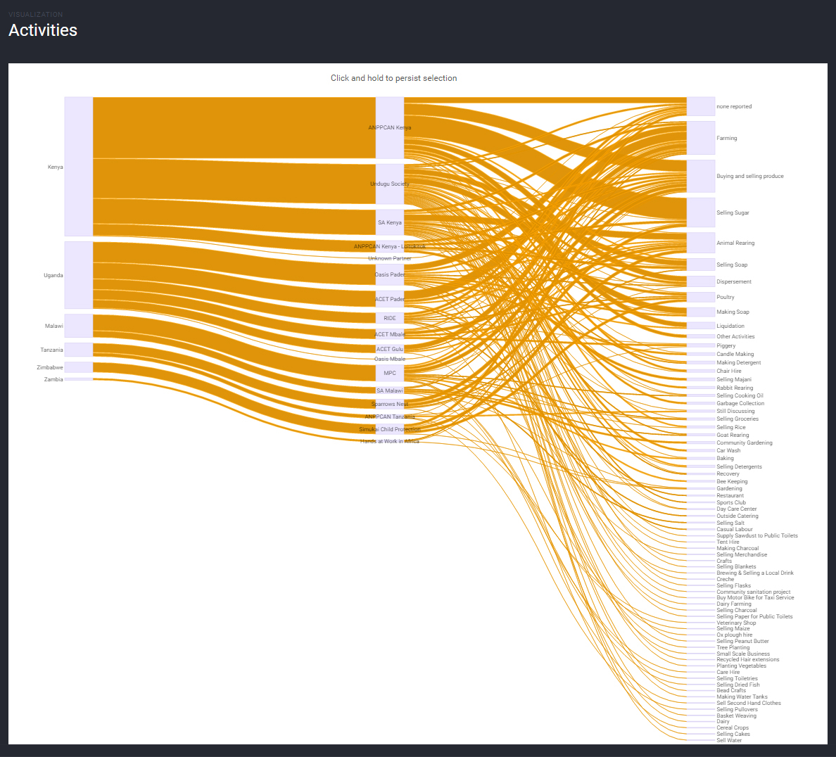
Distribution of activities: This view was the most sought after by the clients, who wanted to understand what activities were most profitable, before analyzing the success factors in order to help expand it to other groups. Hovering over any country, partner or activity highlights all the involved entities, along with the number of groups involved in that particular activity.
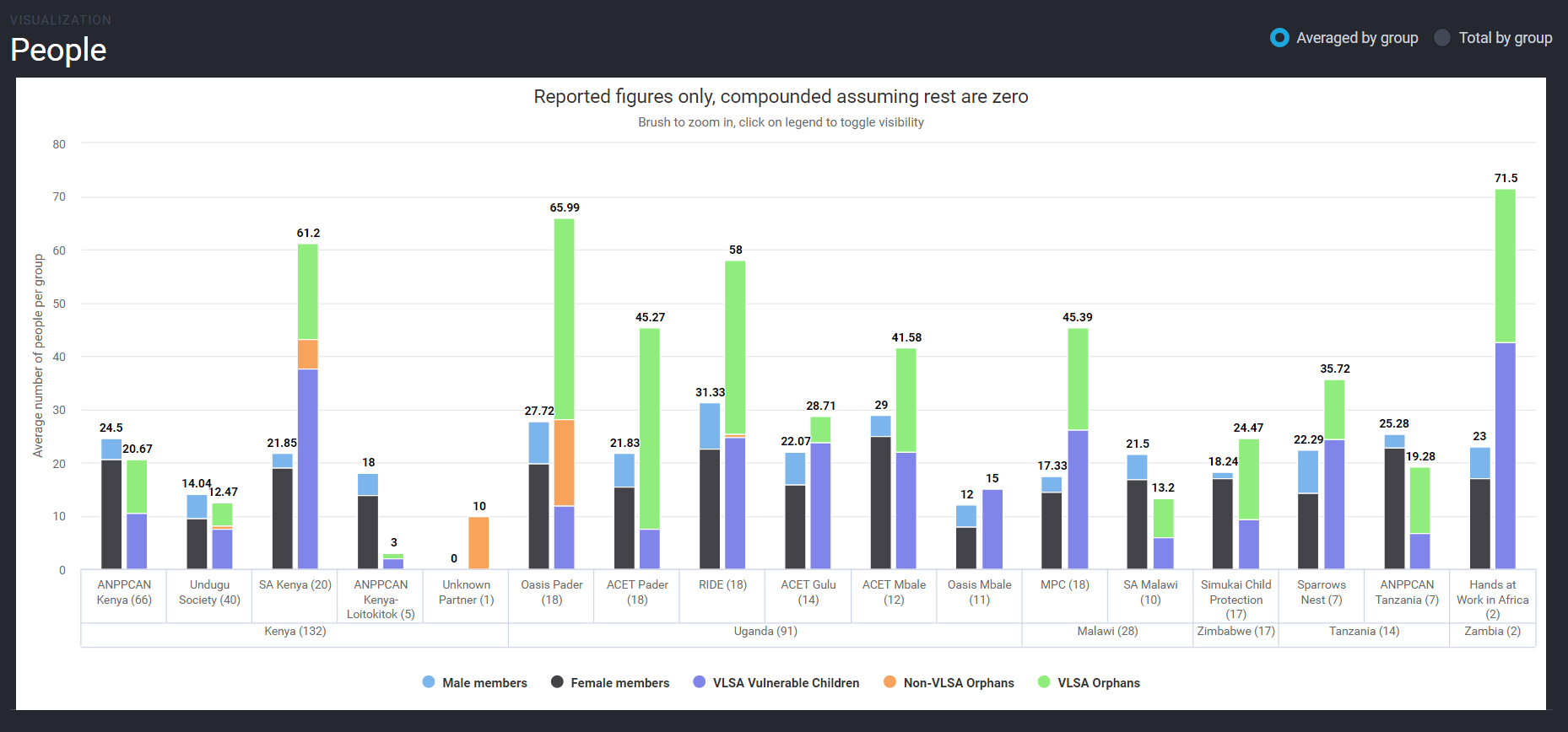
Distribution of people: A simple column chart that shows the number of members and number of dependent vulnerable population under each partner. Entiities can be turned on or off by clicking on the chart legend, and the whole chart can switch between the averaged view and the totals view, in order to normalize for the differing sizes of the groups.
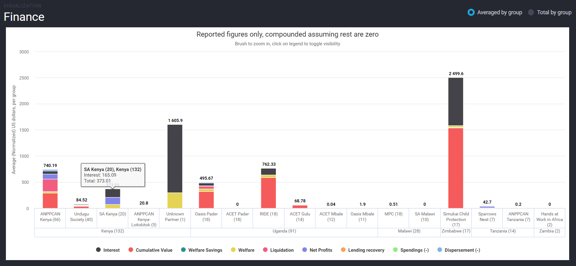
Distribution of finances: Similar to the distribution of people, this column chart shows where money is spent or gained. Entiities can be turned on or off by clicking on the chart legend, and the whole chart can switch between the averaged view and the totals view, in order to normalize for the differing sizes of the groups.
The visualizations we developed were far more effective than the static, Excel based visualizations WeSeeHope were using prior to the project. Our end product served as a means for them to tell their story by interactive means with the limited data they had.
WeSeeHope and Axis Group (whom WeSeeHope had partnered with to get the project implemented) were extremely pleased with the work and expressed delight at the end result. The visualizations were succinct and tailored to the level of their target audience.
 Jayanth
 Lauren
 Mehmet
 Nan
Nan